Plot
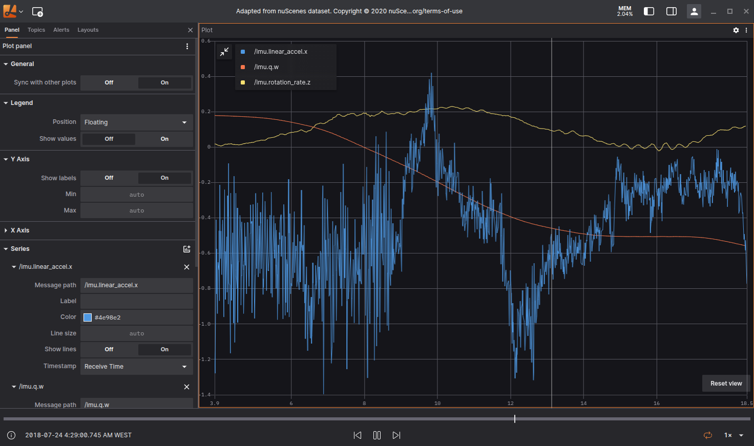
The Plot Panel in Lichtblick is a user interface component designed to facilitate the visualization and control of plotting data. It allows to view, modify, and export graphical representations of datasets or modeling results.
Settings
General
| Field | Descripiton |
|---|---|
| Sync with other plots | Sync timeline to other plots |
Legend
| Field | Descripiton |
|---|---|
| Dislpay Legend | To display or hide the legend use the icon on the top left of the Plot |
| Position | Allows the user to select the position of the legend relative to the plot:
|
| Show Values | Shows the current y-axis value to the corresponding series in the legend |
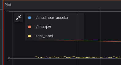
Plot series legend.
Y Axis
| Field | Descripiton |
|---|---|
| Show labels | Option to select if the values are shown, or not, near the y-axis |
| Min | Minimum value for y-axis |
| Max | Maximum value for y-axis |
X Axis
| Field | Descripiton |
|---|---|
| Default Value | Selects the default value for x-axis. Can also be defined individually for each series |
| Show labels | Option to select if the values are shown, or not, near the y-axis |
| Min | Minimum value for y-axis |
| Max | Maximum value for y-axis |
| Range (seconds) | For time series data, selects the time interval of data that will be shown after the current playback point |
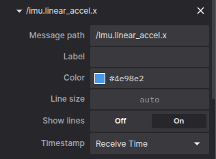
Series
| Field | Descripiton |
|---|---|
| Message path | Message path containing x-axis values for the series. Will override default x-axis values if set |
| Label | Label that can be given to the series |
| Color | Color used on the series |
| Line size | Width of line connecting data points |
| Show lines | Show lines connecting data points. Active by default |
| Timestamp | For time serie plots, selects the time information used for message ordening: |
To remove a series from the Panel you use the x, next to each data series, like it's shown below.
To enter the data you wanna plot use the message path syntax, Lichtblick will also show suggestions that exits on the topics available.
You can also hover the plot to see the details in a tooltip. A vertical bar will appear, as well as a yellow marker on the playback timeline. If clicked the playback will jump to that point on the timeline.
Download CSV data
With right click mouse button an option to download the plotted as .csv will appear.